

In semiconductor and electronics, success hinges on reliable data analytics. Optimal Plus needed a rebrand to reflect its core value: lifecycle analytics you can trust. This transformation positioned this SaaS company for a $365 million sale within a year.
From Optimal Plus to O+
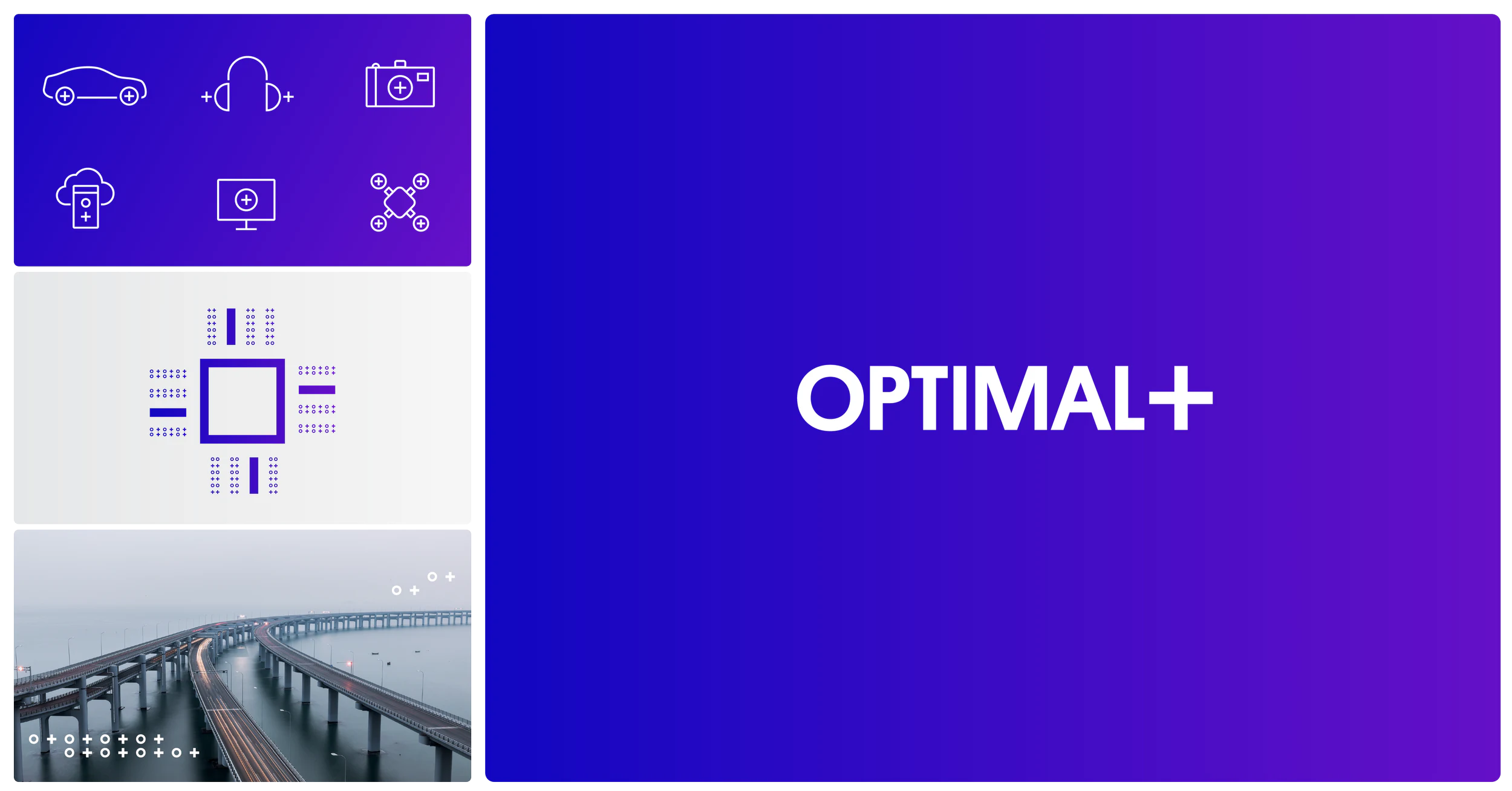
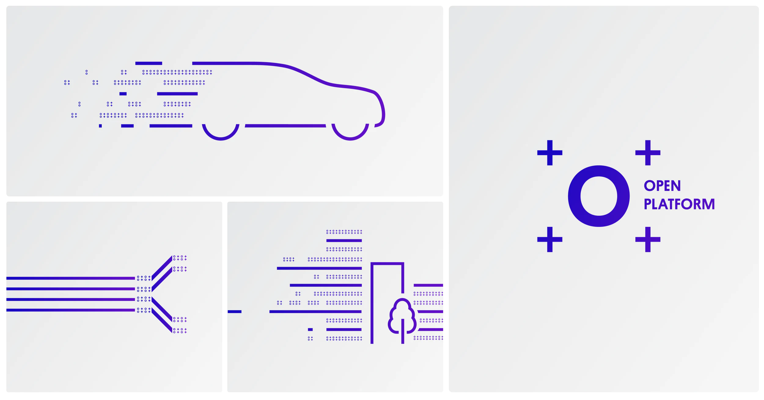
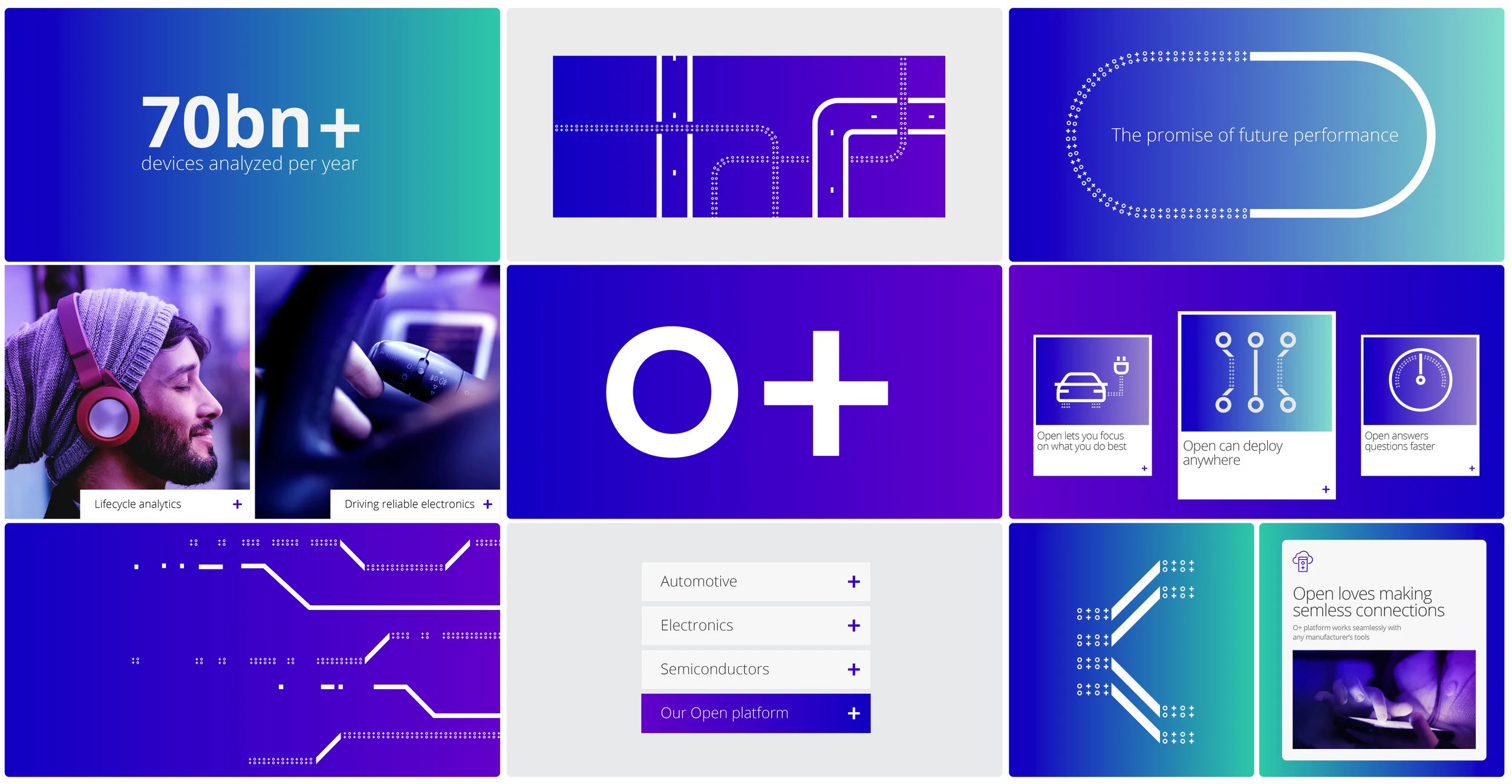
The rebrand simplified Optimal Plus into O+, a symbol of clarity and precision. Inspired by binary code, the universal language of the digital world, the "O+" symbol reflected the company's role in simplifying complexity. Its clean, minimal design embodied trust and reliability, becoming the cornerstone of the new brand.
A Visual Language Built on Data
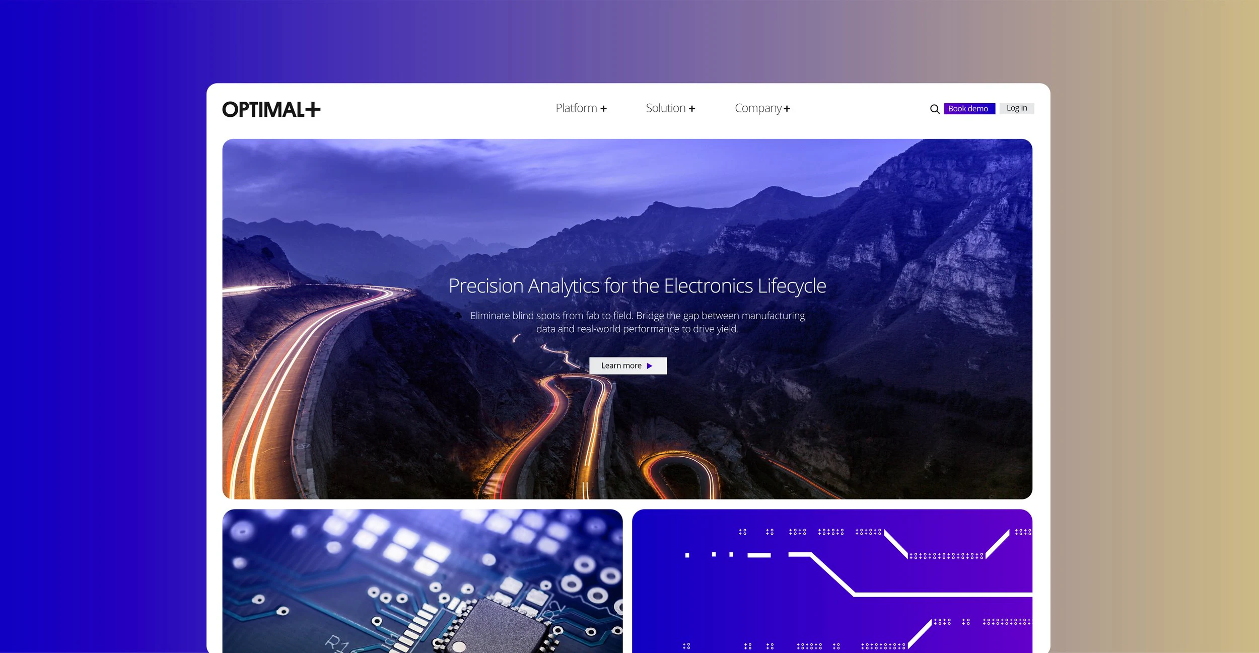
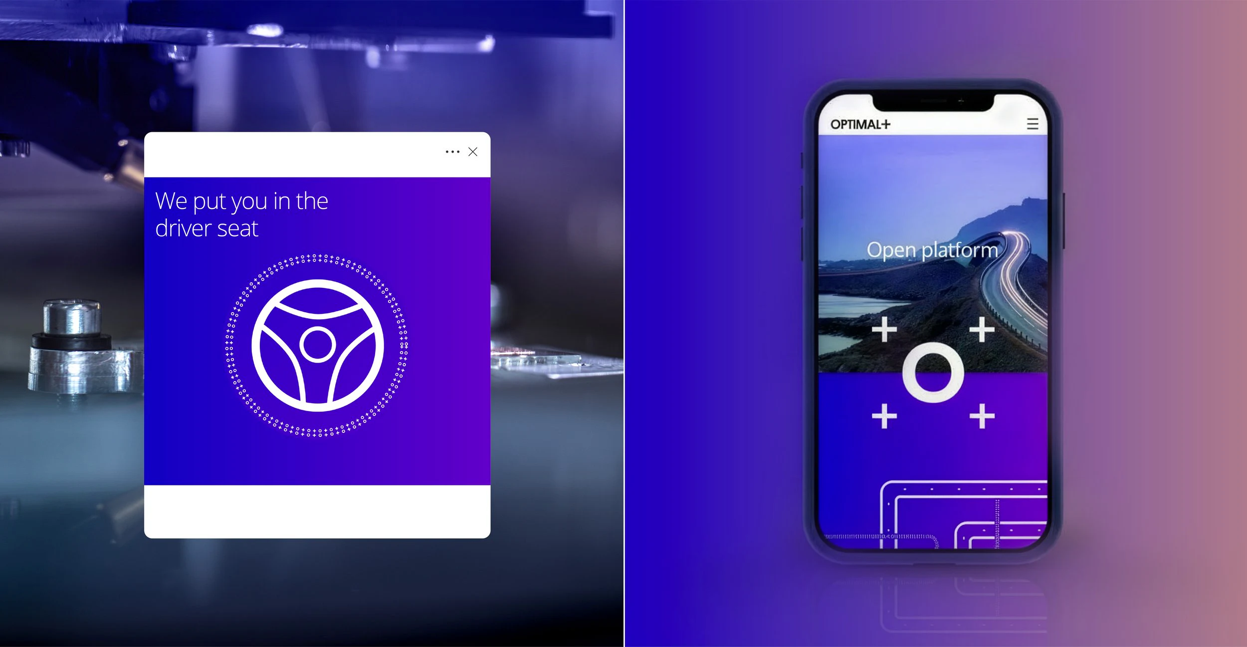
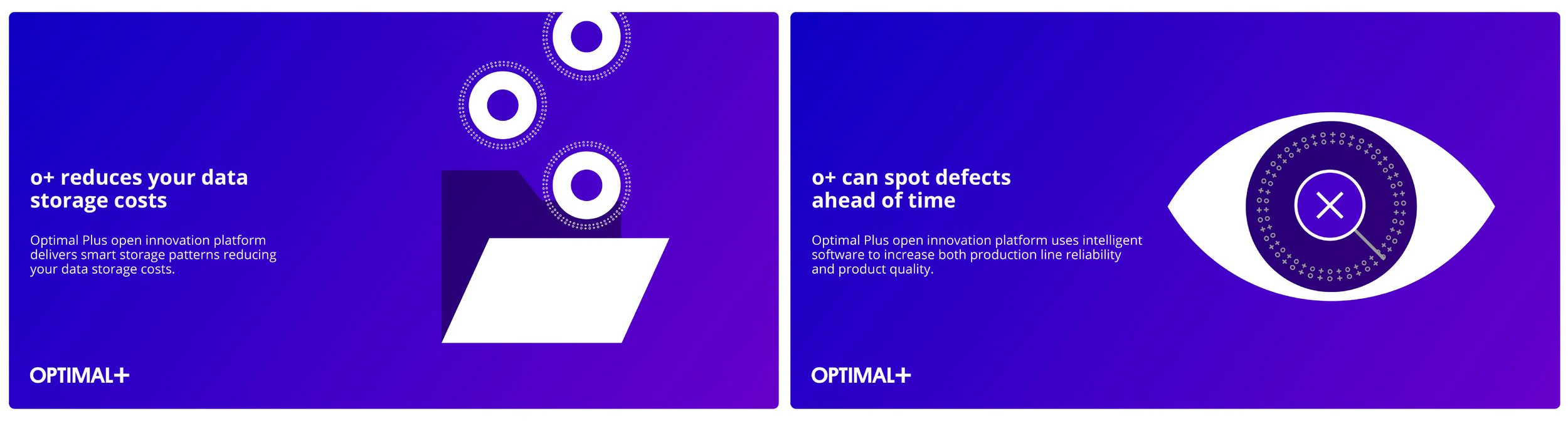
Drawing from the structure and flow of code, the new visual identity used sharp lines, geometric forms, and bold iconography to communicate precision and scalability. This approach reinforced the company's reputation as a leader in big data analytics, making its solutions feel both cutting-edge and accessible.
A Foundation for Success
The rebrand sharpened Optimal Plus's image and strengthened its market positioning. By simplifying complexity and projecting authority, the new identity played a pivotal role in securing the company's acquisition, leaving a lasting impact in the competitive tech landscape.


In semiconductor and electronics, success hinges on reliable data analytics. Optimal Plus needed a rebrand to reflect its core value: lifecycle analytics you can trust. This transformation positioned this SaaS company for a $365 million sale within a year.
From Optimal Plus to O+
The rebrand simplified Optimal Plus into O+, a symbol of clarity and precision. Inspired by binary code, the universal language of the digital world, the "O+" symbol reflected the company's role in simplifying complexity. Its clean, minimal design embodied trust and reliability, becoming the cornerstone of the new brand.
A Visual Language Built on Data
Drawing from the structure and flow of code, the new visual identity used sharp lines, geometric forms, and bold iconography to communicate precision and scalability. This approach reinforced the company's reputation as a leader in big data analytics, making its solutions feel both cutting-edge and accessible.
A Foundation for Success
The rebrand sharpened Optimal Plus's image and strengthened its market positioning. By simplifying complexity and projecting authority, the new identity played a pivotal role in securing the company's acquisition, leaving a lasting impact in the competitive tech landscape.
