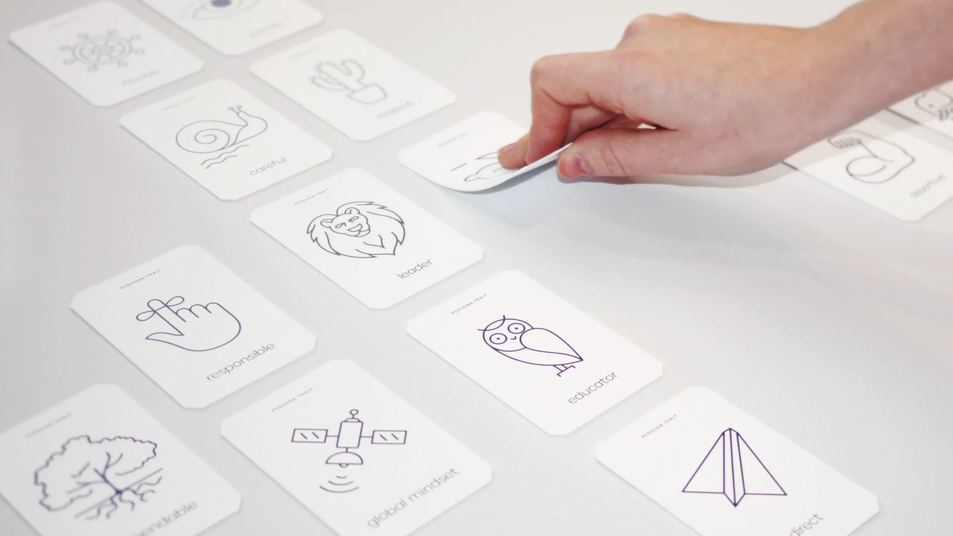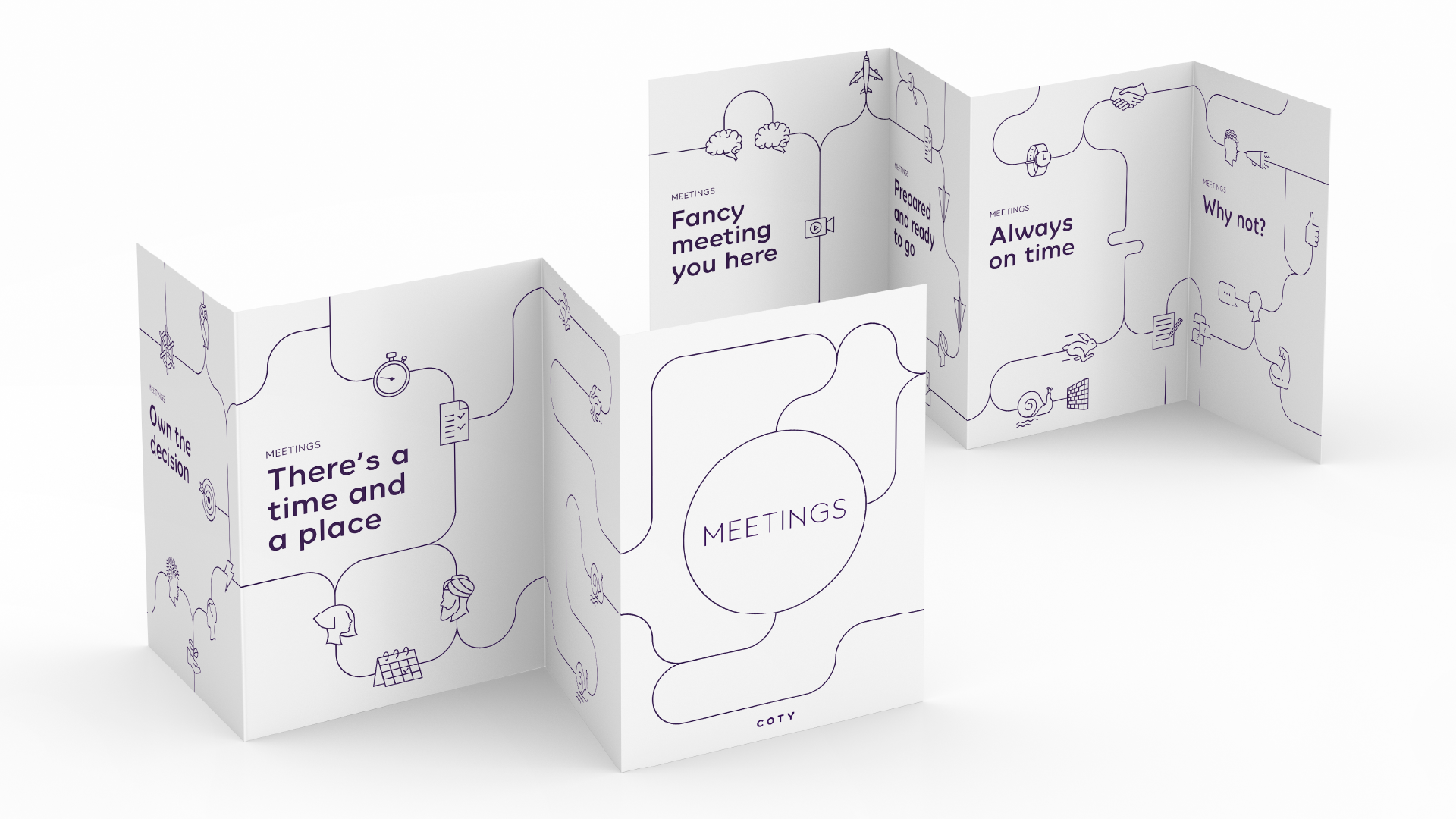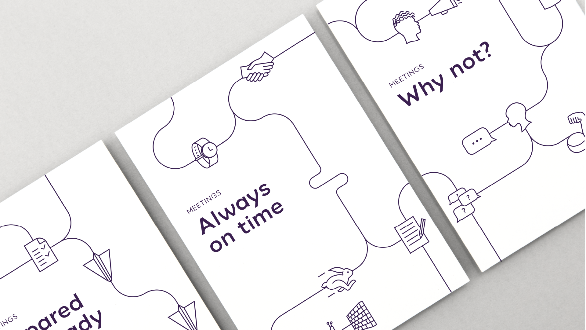
Every business needs creative tools to communicate effectively. For Coty, this need emerged while tackling an unusual challenge, making topics like cost efficiency, travel, and meeting etiquette engaging. The solution lay in creating a bespoke illustrative language, derived from the elegant curves of Coty Sans, the custom font developed for Coty’s brand identity.
Agency: Workroom
Industry: Corporate Communications
The toolkit: Employer Branding | Internal Communications | Employee Engagement
Coty: Crafting a Distinctive Illustrative Language
The goal was to create a linear drawing style that was versatile enough to generate countless icons and evolve into a storytelling tool. This distinctive graphic language had to be sustainable, with a systematic framework enabling Coty to produce new imagery independently, ensuring consistency across all touchpoints.
Systematic Artistry
To achieve this, a grid system was designed, ensuring every icon adhered to the same proportions and line weight. This approach provided the foundation for a cohesive system where individual icons could be combined using conductors or joiners to form larger, intricate illustrations, turning simple visuals into engaging narratives.
A Lasting Impact
The result was a timeless, flexible design language that empowered Coty to communicate even the driest topics with clarity and creativity. By embedding sustainability into the system, the illustrative language became a valuable, enduring asset, aligning seamlessly with Coty’s dynamic brand identity.
