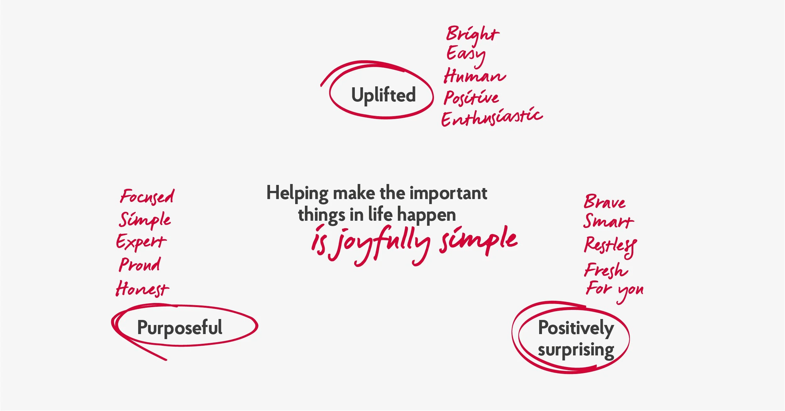
The Post Office has always been part of British life, but it needed a fresh focus. At its heart is a simple idea: helping the important things in life happen. From sending a thoughtful gift to planning a dream holiday, the Post Office set out to make life easier and more joyful.
Agency: FutureBrand
Industry: Retail & Financial Services
The toolkit: Brand Identity | Brand toolkit | Campaign Direction | Digital Integration
The Post Office Effect: Adding Joy with a Red Pen
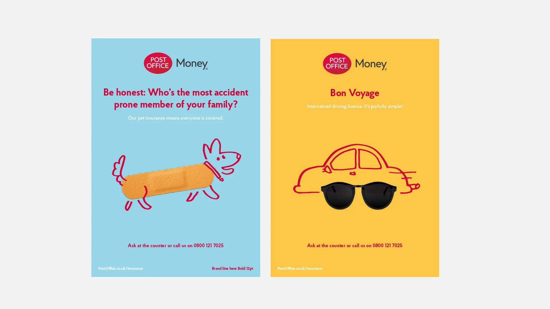
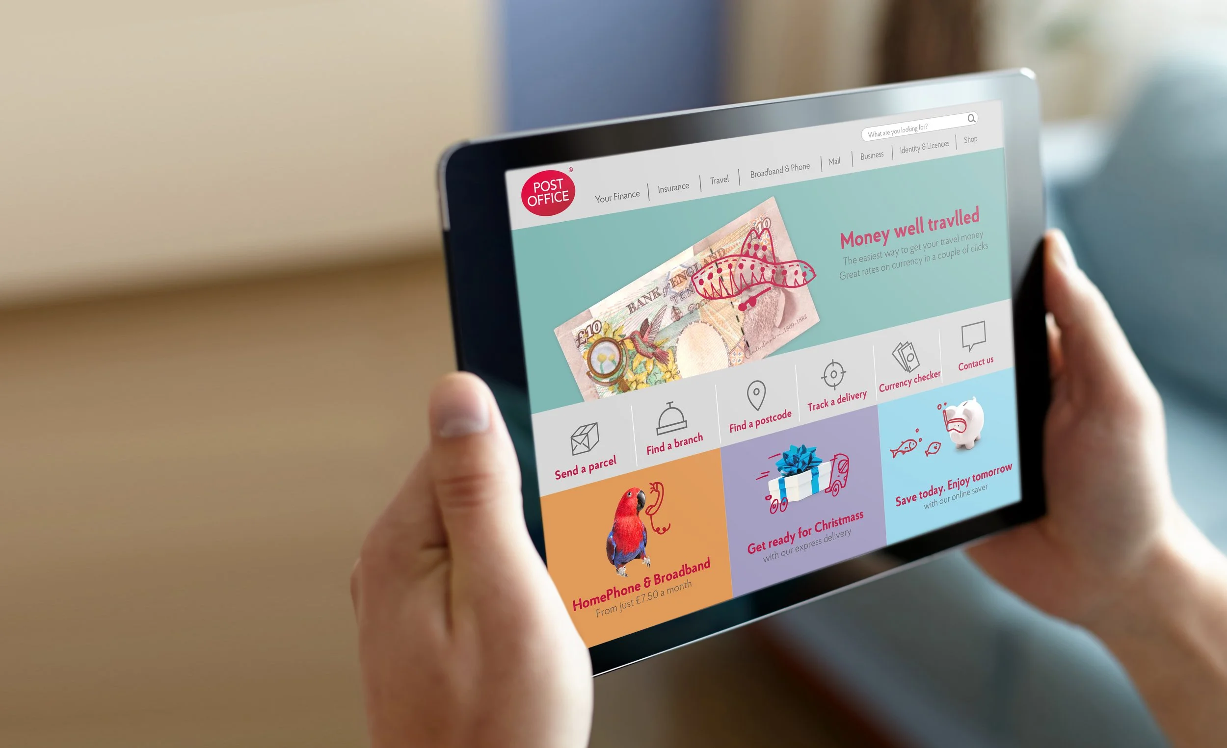
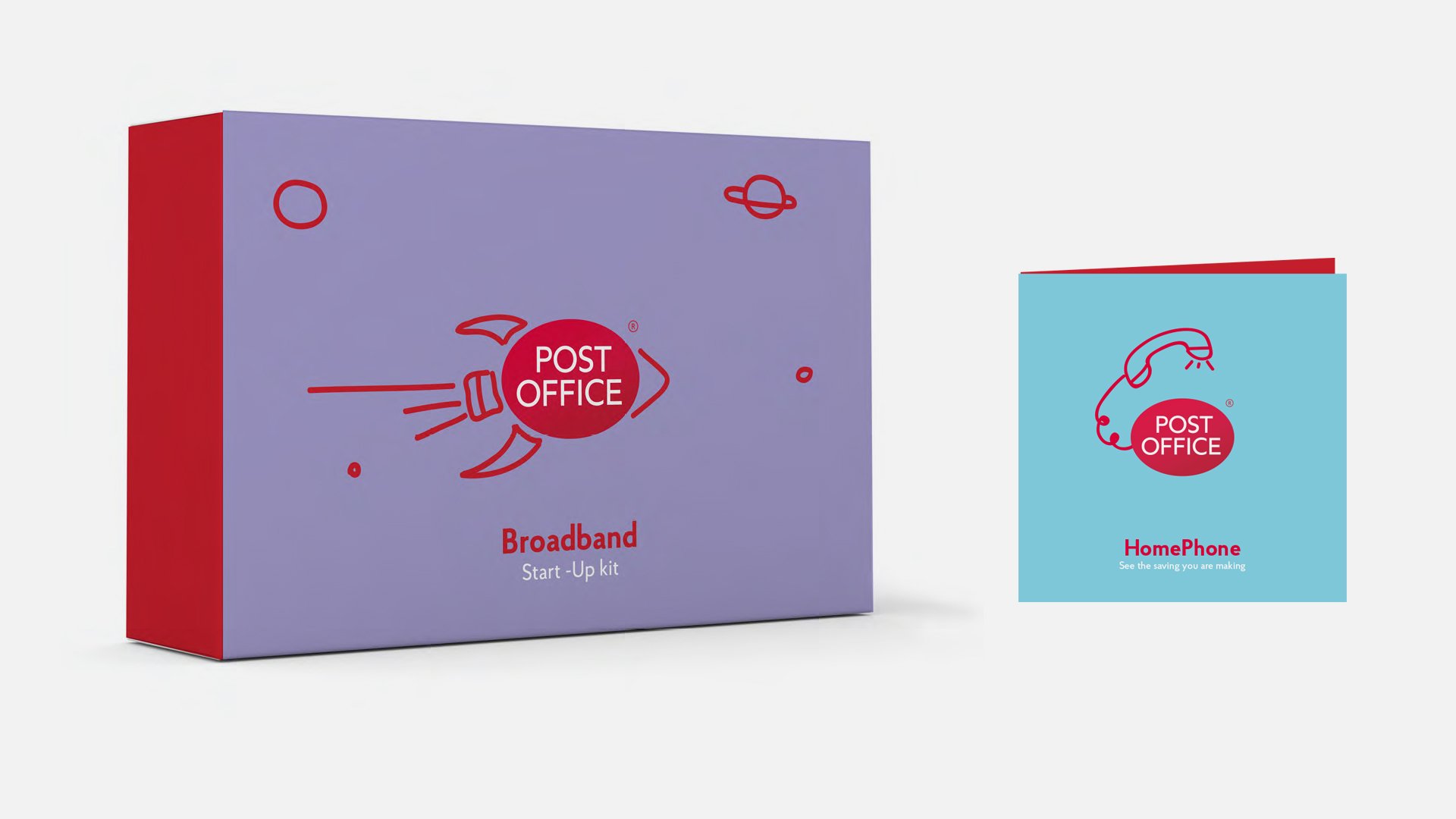
The Post Office Effect brought Joyfully Simple to life with a bold red pen. Spontaneous doodles were added to images and typography, turning everyday moments into something fun, helpful, and engaging. These illustrations transformed the ordinary into stories, reflecting the brand’s role in making life simpler and more enjoyable.
A System of Simplicity
The red pen illustrations were crafted to feel spontaneous yet purposeful. Avoiding unnecessary details, each drawing served a clear purpose, whether highlighting a product’s value or enhancing an ad’s message. This approach reinforced the brand’s commitment to clarity and joy.
Transforming Perceptions
By embracing Joyfully Simple and the Post Office Effect, the rebrand changed how people viewed this iconic institution. It focused on the moments that matter, showing how the Post Office helps connect lives in meaningful ways. A playful, unified visual identity redefined the brand as a joyful enabler of life’s most important moments.


