As a well-known vitamin brand, Redoxon set out to redefine its purpose with a bold new vision: to become Europe’s most trusted immunity brand. This vision was brought to life with the creative platform “Strong immunity, strong community”, which celebrated the strength of communities by highlighting the individuals who make them thrive.
Agency: Interbrand
Industry: Health & Wellness
The toolkit: Creative Vision | Brand Community | Creative Direction | Social Impact
Building Stronger Immunity and Community
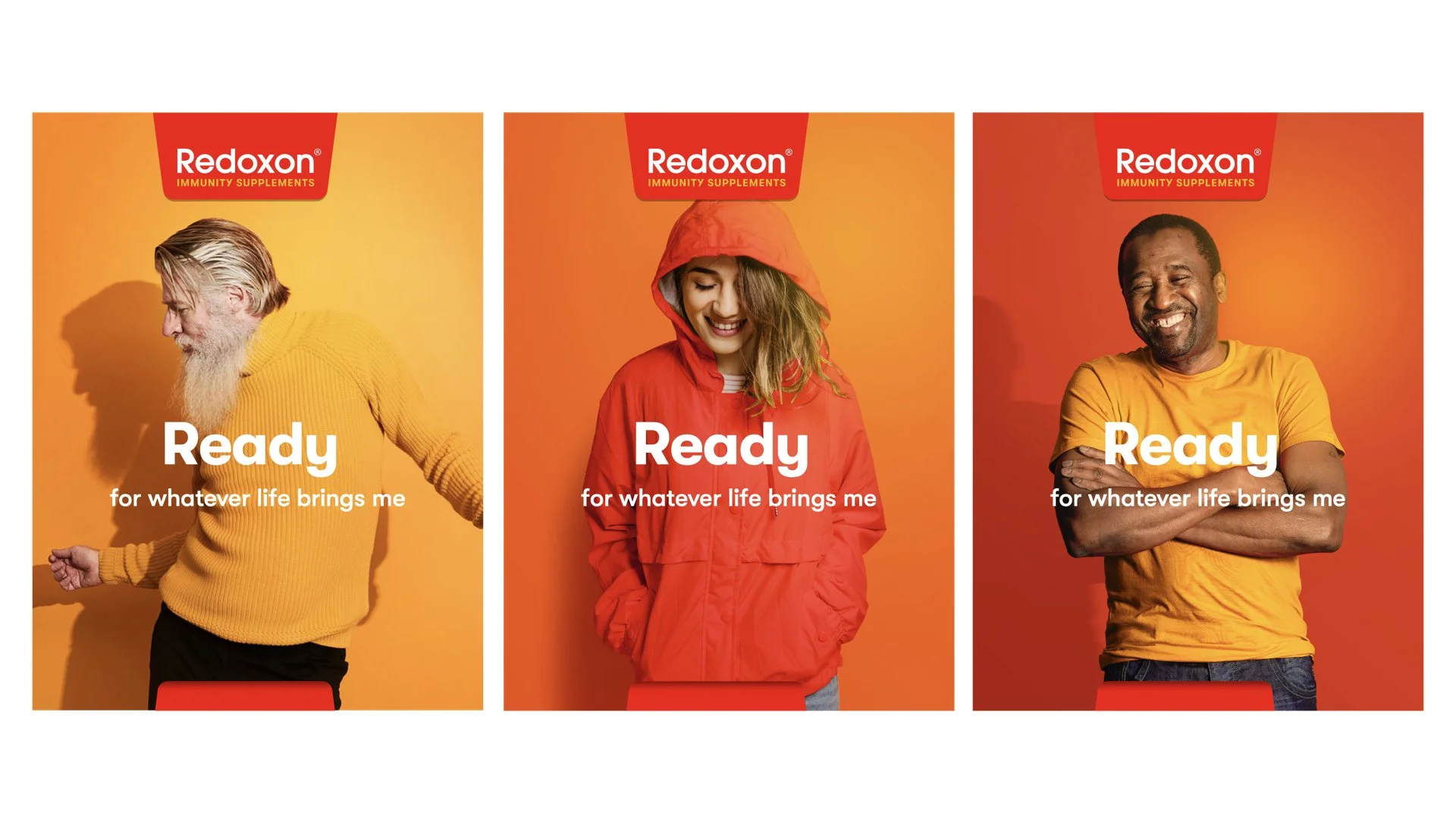
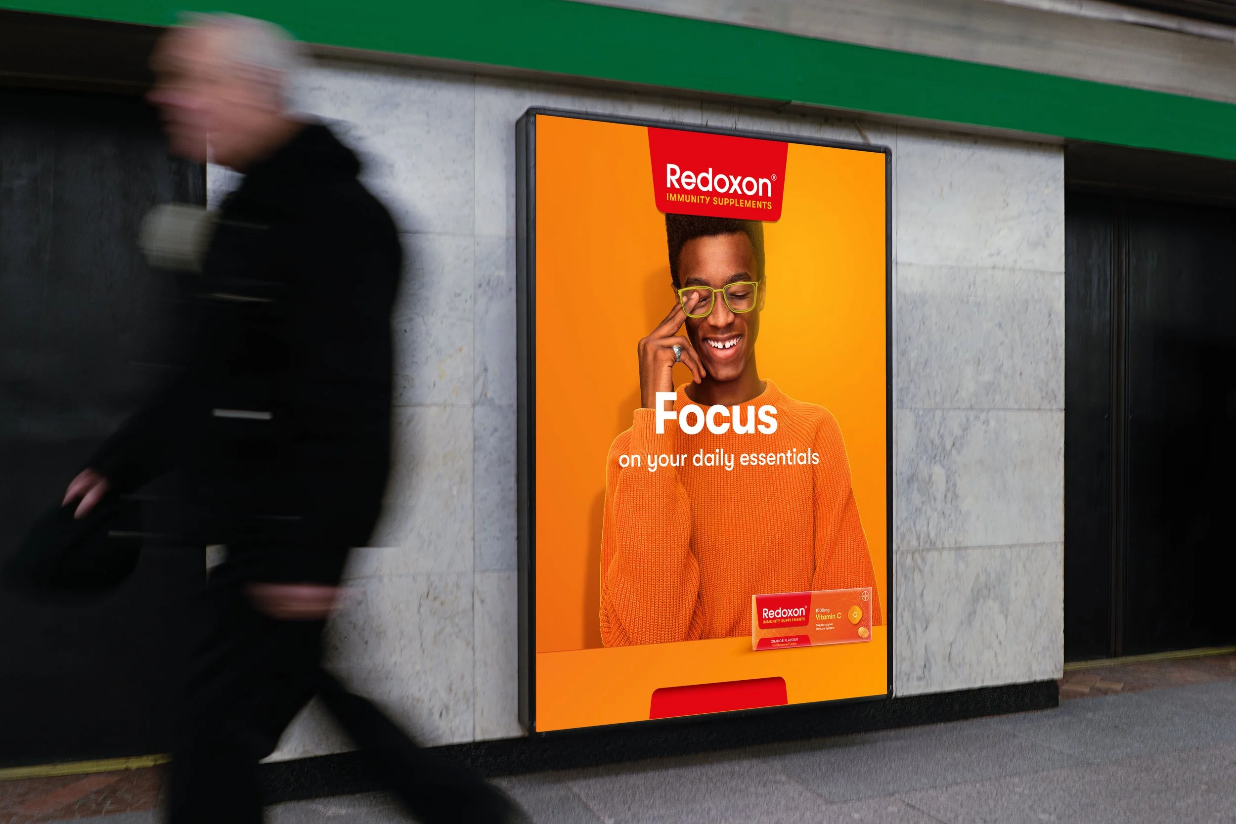
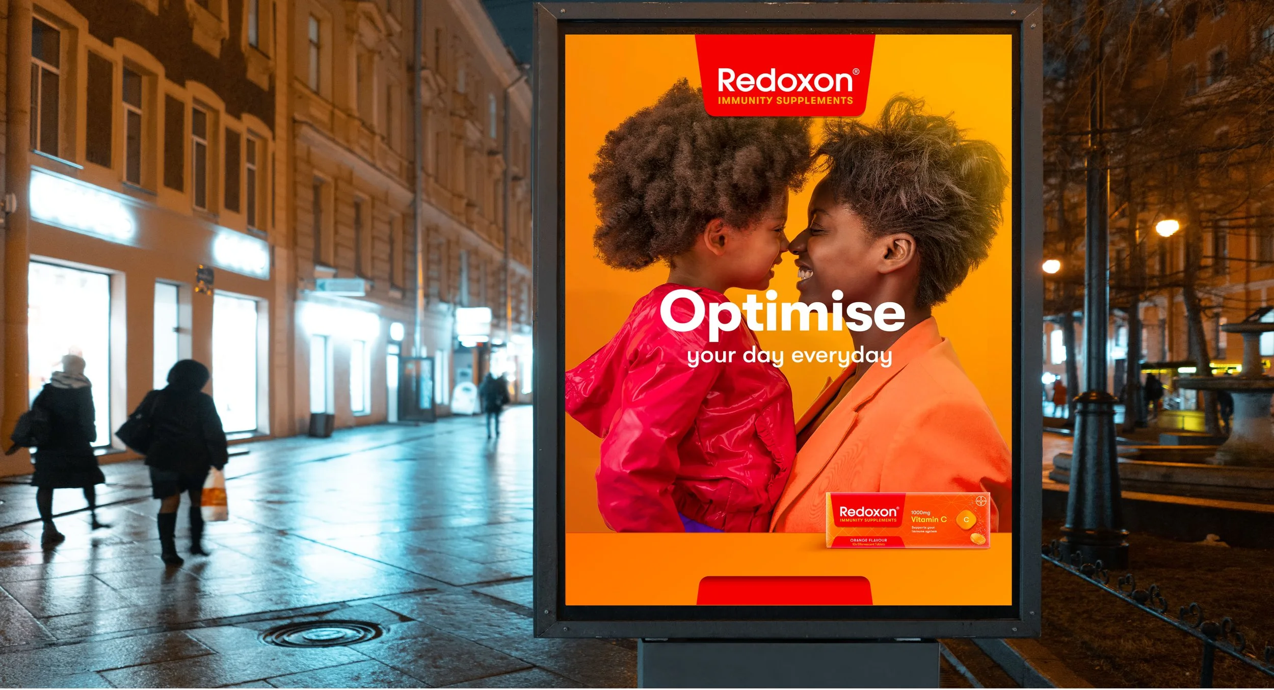
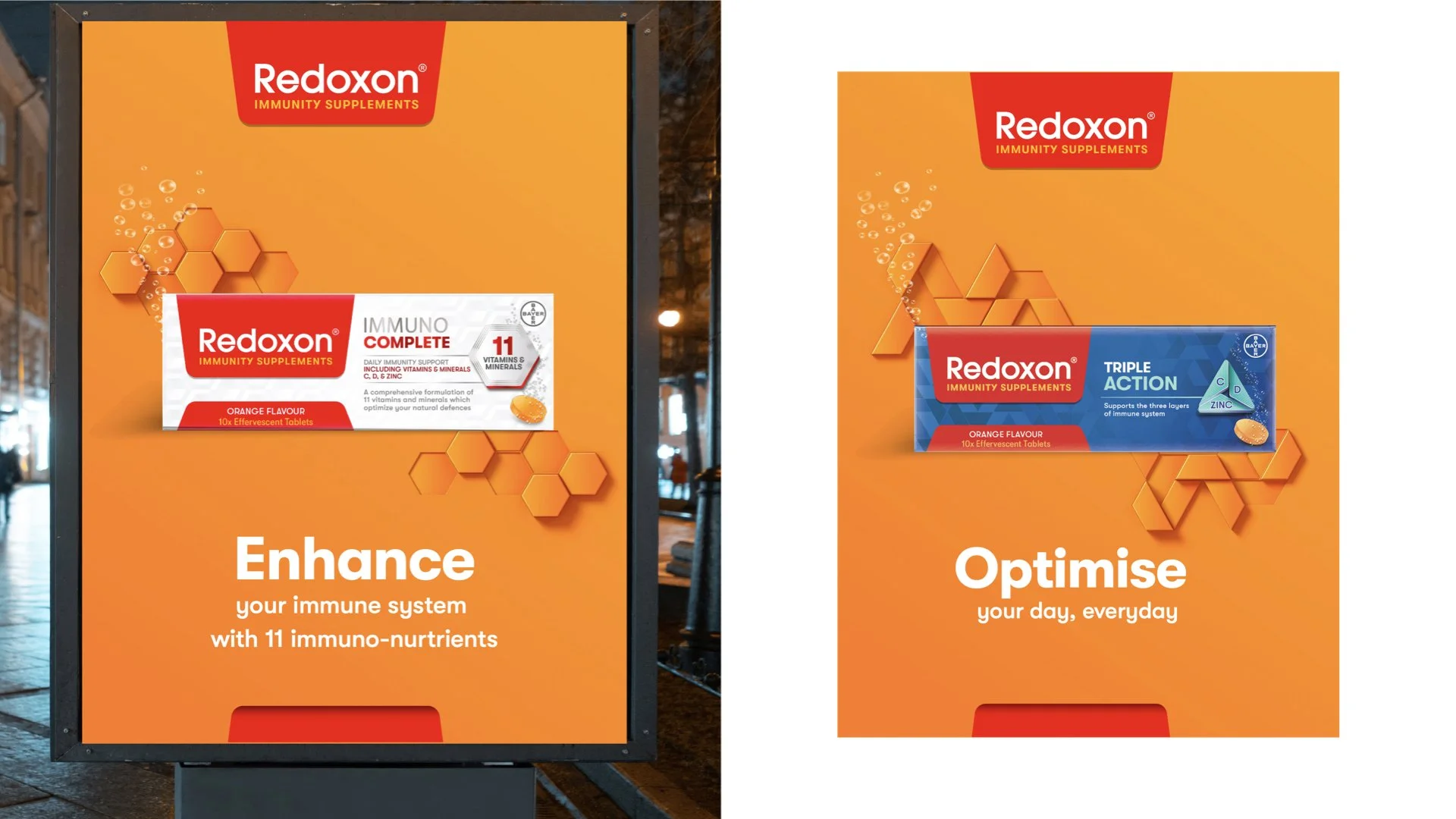
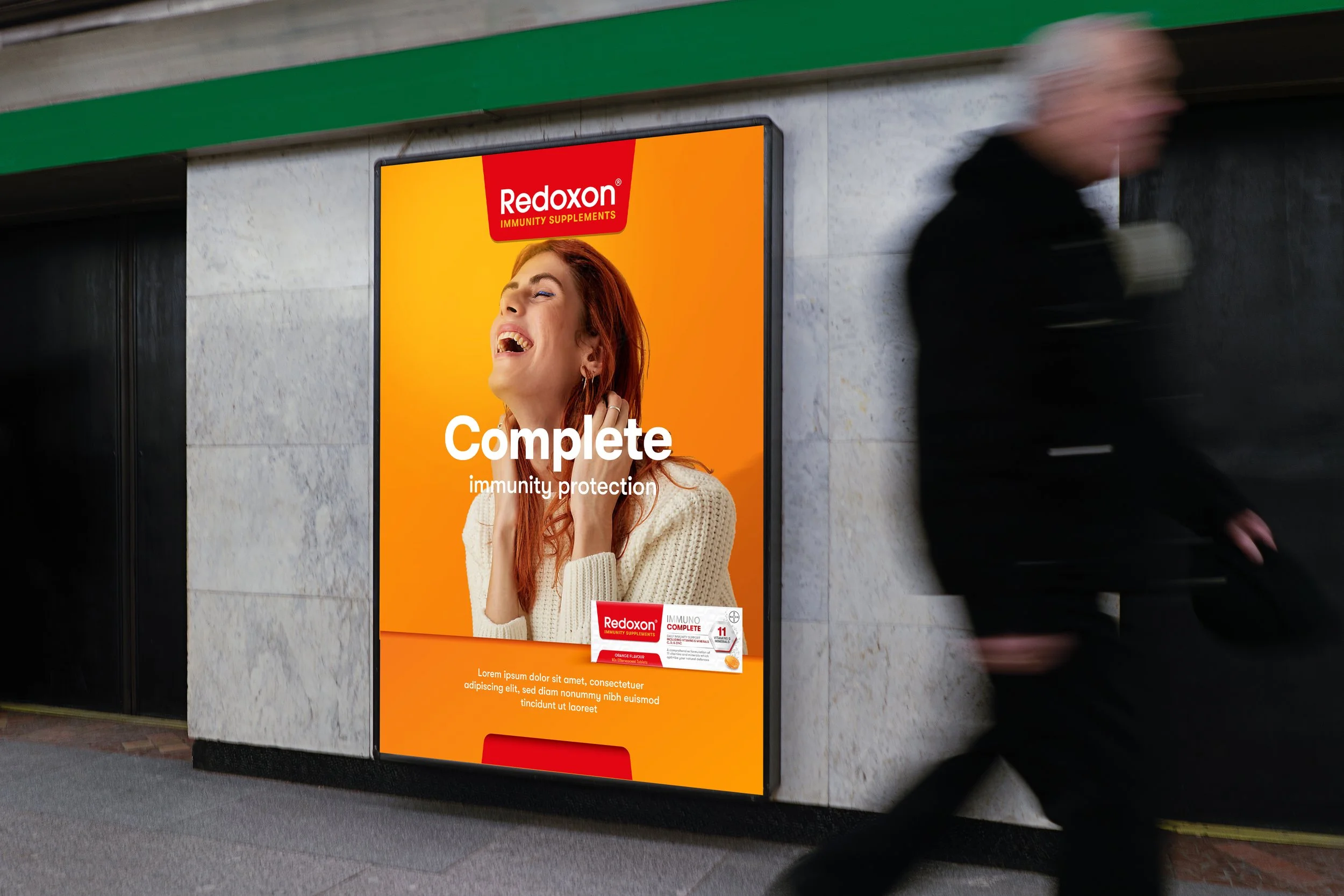
The Visual Brand Language (VBL) was developed to break away from conventional lifestyle imagery. Photography art direction focused on studio shots of individuals, set against the brand’s vibrant orange backdrop. This clean, bold approach placed emphasis on the unique personality of each community member, making the visuals iconic and memorable while avoiding overused clichés.
Bold in Every Format
The campaign took to large-scale billboards and other high-impact formats, allowing the strong visuals to capture attention across diverse settings. The vibrant orange backdrop created a consistent, recognisable presence, while the focus on individuals emphasised the connection between personal immunity and collective strength. By steering clear of generic lifestyle photography, the work brought a fresh and compelling perspective to public spaces.
An Elevated Vision
This creative direction sought to amplify Redoxon’s purpose and connect with audiences on a more personal level. By celebrating the strength of individuals within the community, the platform provided a compelling foundation for the brand to grow and evolve.