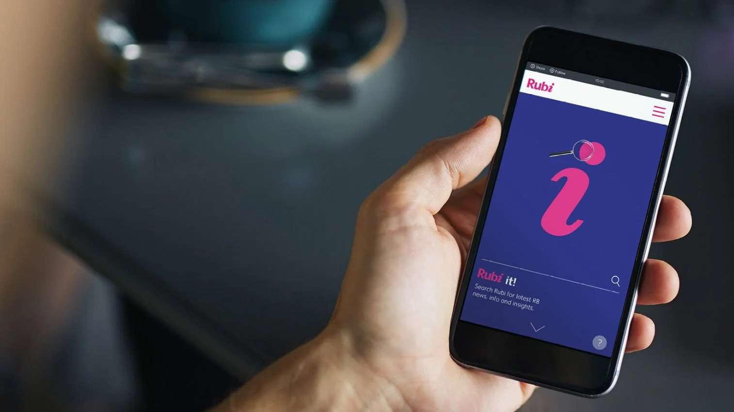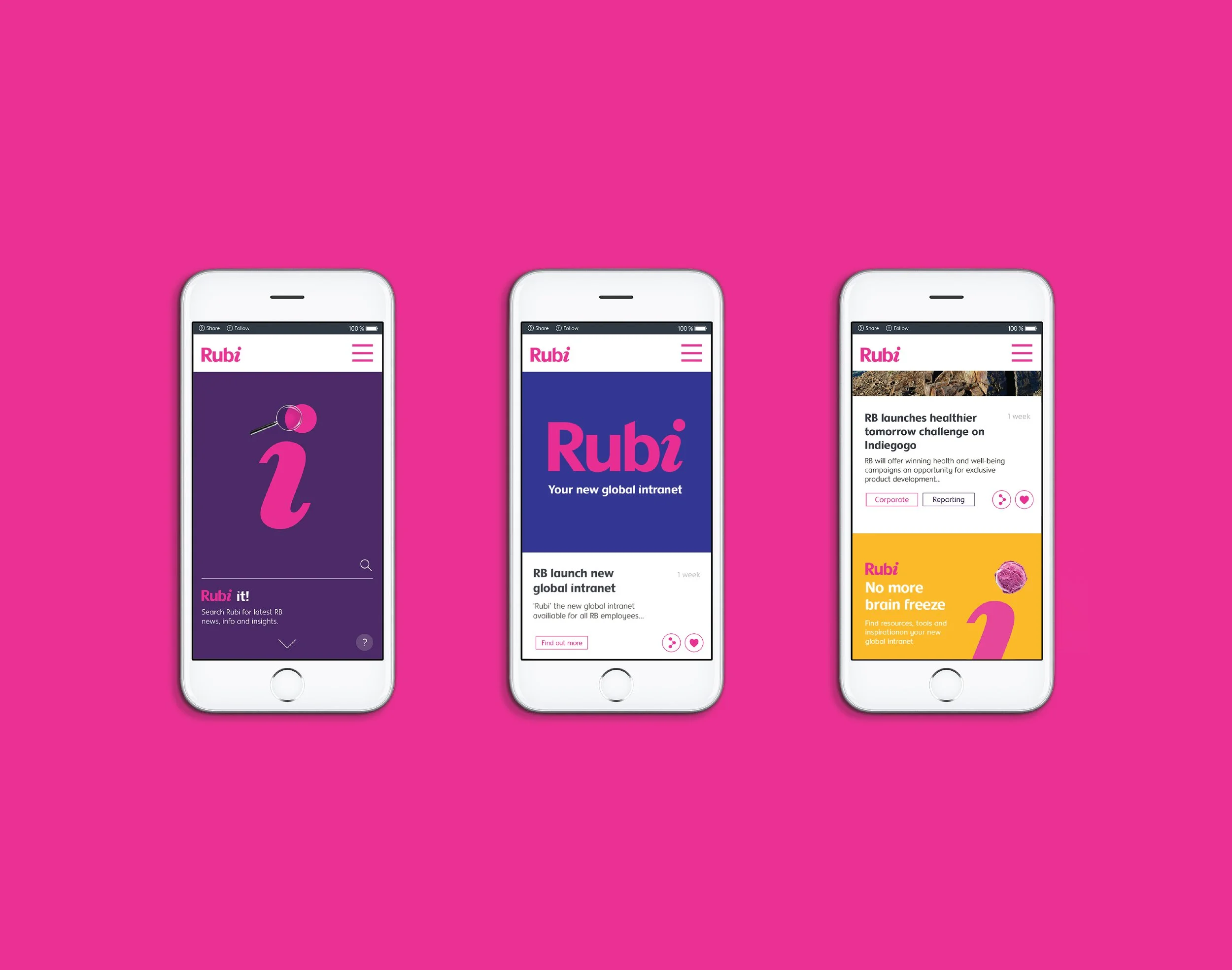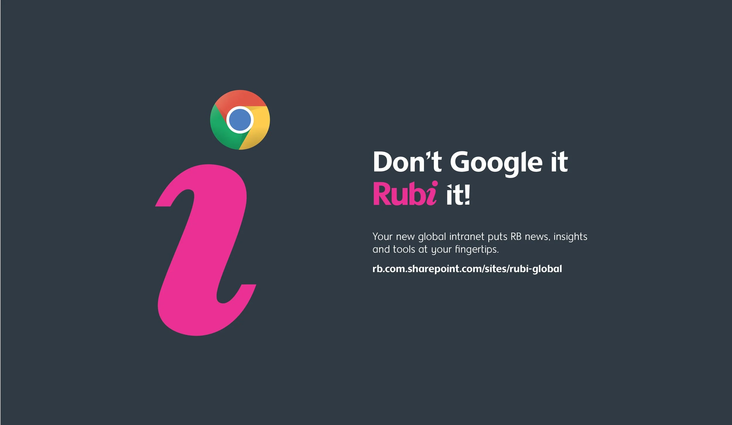
Rubi was created as Reckitt Benckiser’s new intranet, a global tool designed to help employees across 40 offices find and share useful information and inspiring stories. This one-stop shop needed an identity that felt fresh and engaging while aligning with RB’s existing brand.
Agency: Workroom
Industry: Consumer Goods | Health & Hygiene
The toolkit: Employer Brand | Internal Campaign | Digital Workspace | UX/UI
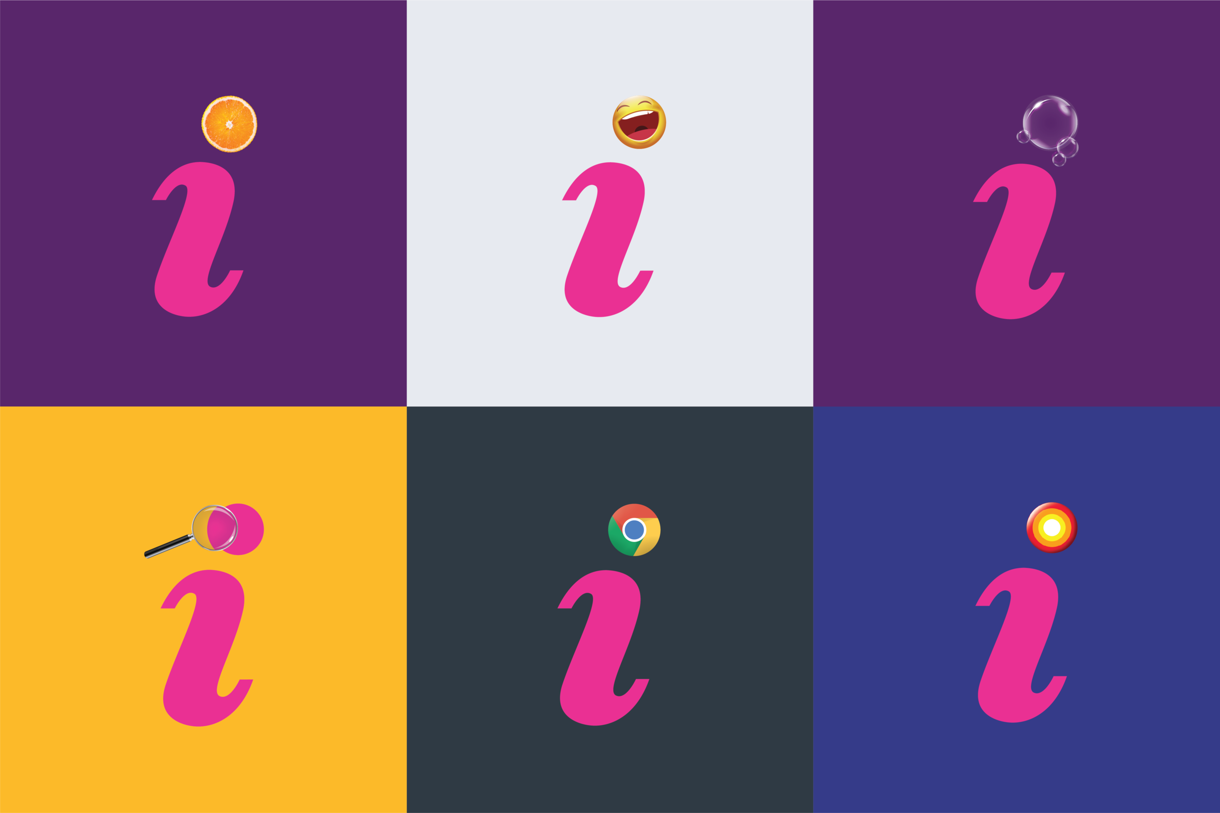
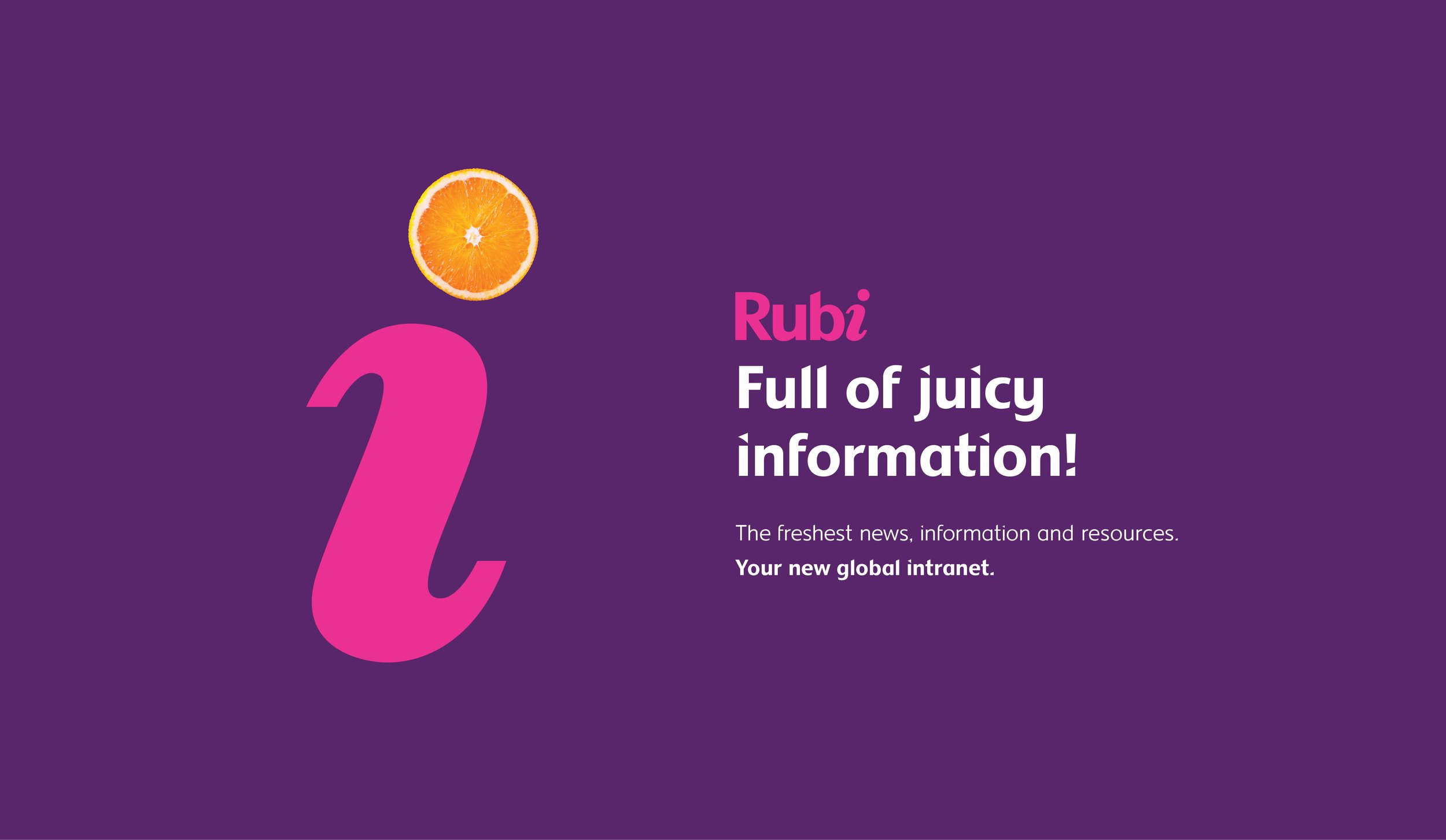
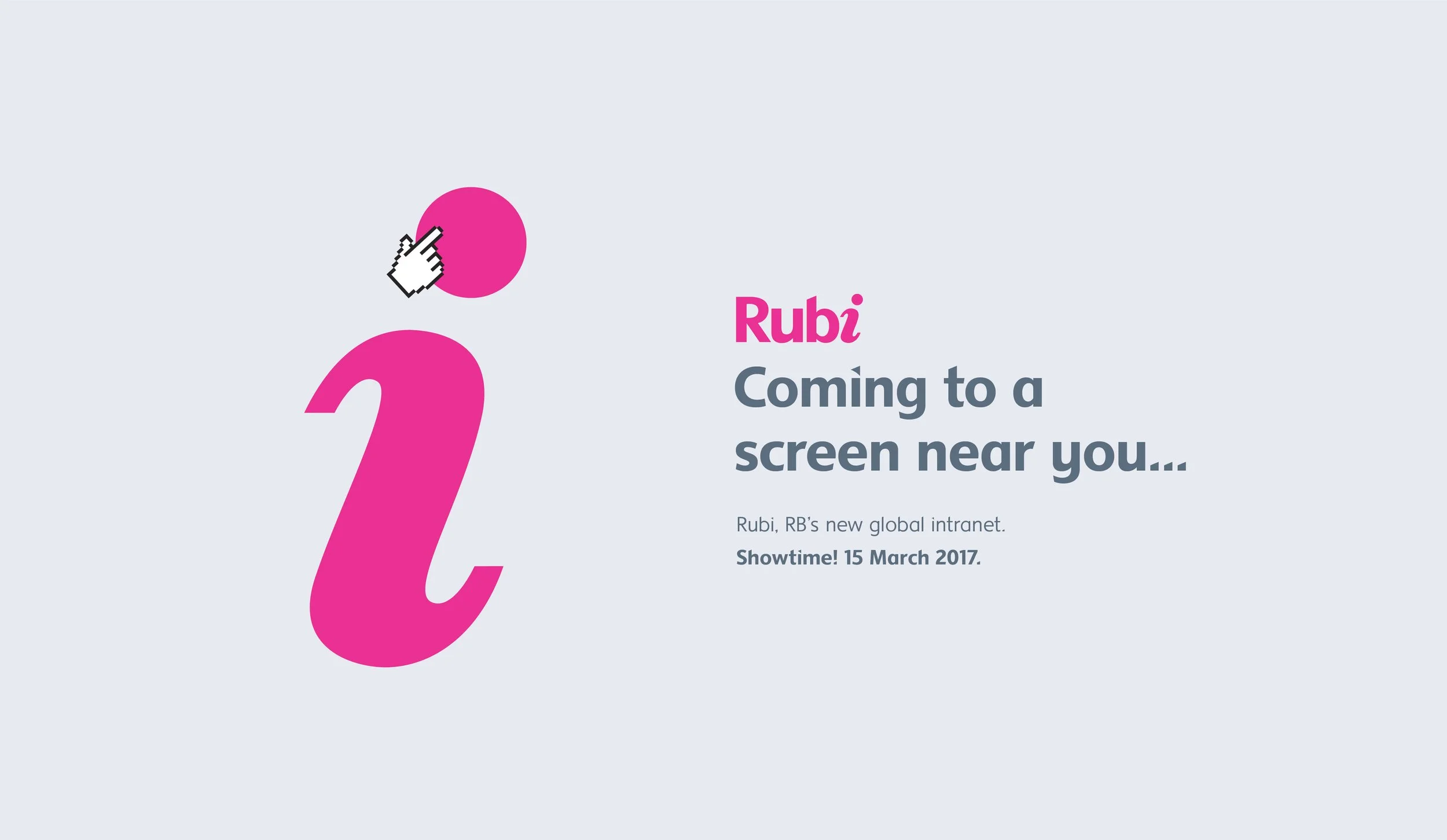
An ‘i’ for Information and Ideas
The new identity used RB’s visual language as a foundation but added a dynamic twist. At its centre was the italicised ‘i,’ symbolising information and connection. The dot of the ‘i’ became a constantly evolving element, representing new ideas, insights, and stories. This flexible approach allowed the brand to feel dynamic and responsive, always highlighting the latest updates or themes.
Playful Engagement Through Tone of Voice
To encourage employees to engage with Rubi, a playful tone of voice was developed, making internal communications feel approachable and fun. This language brought life to the platform, creating a sense of community and making the experience of using the intranet more enjoyable.
A Global Identity for Connection
Rubi’s vibrant and flexible identity united RB’s global workforce, fostering collaboration and knowledge-sharing across offices worldwide. By combining a visually dynamic design with an engaging tone, Rubi became more than a tool, it became a symbol of innovation and connection for RB employees.